
Many people who read wine publications on a casual basis or who just peruse the endorsements on the bins at the local liquor emporium buy their wine by the score. And I don’t mean twenty at a time (although that may be the case). Rather they buy a wine that scores 90 or more points and fits within their budget, instead of trying to understand what the wine might actually taste like. In order to get a better idea of the validity of scoring, I’ve done some research on recent reviews and scores in several prominent wine publications, namely:
Basically, I’m comparing British scoring (the last three publications) to the gold standard for American scoring – Robert Parker and his tasting team. Parker uses his famous 100 point system where 50 is the lowest possible score and 100 is “perfection”. British writers lean towards a 20 point system where scores can (rarely) dip into the single digits. Decanter provides a convenient translation between their 20 point system and a 100 point system – we’ll take a look at it a little later. Fine Wine also has a (different) correlation. To make the comparison, I selected a few wine types (region and vintage) that were recently reviewed in The Wine Advocate and some of the UK publications. Then I plotted the 20 point scores against the 100 point scores (each point on the graph is a single specific wine). First, the bad news. Here is what you get for 2010 Napa Cabernet Sauvignon:
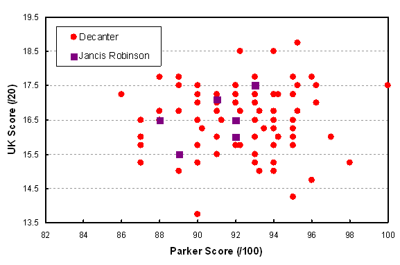
Comparison of UK 20 point scores with US (Parker) 100 point scores for Napa Valley Cabernet Sauvignon from the 2010 vintage.
Mathematically, we call this kind of a chart “uncorrelated”, especially for the Decanter scores. In other words, the relationship between Parker and Decanter scores is completely random. I can’t quite say the same for the Jancis Robinson data as there is a mild positive correlation (i.e. higher Parker scores are roughly matched by higher JR scores), but it’s still poor. This picture is therefore relevant to the controversy that’s been making the rounds recently about the value of critical reviews and scores. The studies cited in this article generally conclude that there are so many external variables affecting even an expert’s ability to judge wine that the results are almost indistinguishable from random. So let’s look at more of the data that I have assembled and see if that idea holds true in other cases. First we’ll move away from California Cab towards its flip side, French Merlot and in particular St. Emilion 2011. The results are shown in the graph below:
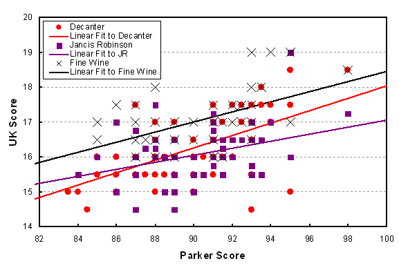
Comparison of UK scoring with American (Parker) scoring for 2011 vintage of St. Emilion. The lines are statistical best fits to the data for each of the three UK publications.
OK, there’s a bit of a correlation here. I’ve drawn the best linear fit lines to each of the three data sets, and at least we can say that all of them show a positive correlation. BUT, there is no indication that UK and American reviewers had conflicting tastes, contrary to all the talk about the supposed preference for balanced food-friendly terroir-driven wines on the one side, and blockbuster fruit-forward winemaker-driven wines on the other. One thing to notice is that when reviewing for The World of Fine Wine, the scores were somewhat higher in general than when reviewing for Decanter or Jancis Robinson. Therefore the scores may be consistent within one scheme, but it is not advisable to compare absolute scores across publications.
For the next exploration, we’ll head to Burgundy. First, let’s look at a very specific wine: 2011 Vosne-Romanée, ranging from simple village wine all the way up to the Grands Crus:
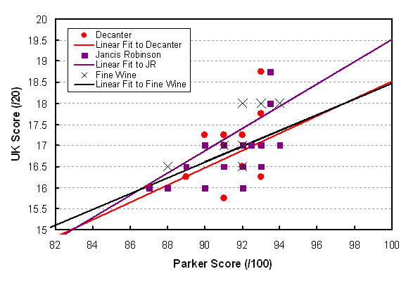
Comparison of UK scores with American (Parker) scores for the 2010 vintage of Vosne-Romanée. The lines are best statistical fits to the data.
At least there’s a bit more action here. The high scores roughly match the high scores and the low scores also roughly correspond. Otherwise the conclusions that can be drawn from this graph don’t differ much from the St. Emilion case. One thing we should remember is that even professionals have different tasting hardware (i.e. nose and tongue) from one another, not to mention different software (i.e. preferences). Therefore it may still be true that a particular expert taster is consistent within his or her set of scores, according to personal standards. Now these standards are still partly influenced by training and experience, resulting in the modest correlation between tasters. If this idea is valid, then we return to one of the most important truisms about taking advice from the experts; i.e., find a taster that likes the wines you like, or better yet, that describes them in a way that lets you make a selection with a high probability of getting something you enjoy. My personal favourite is John Szabo, who talks about style in preference to rolling out a fruit basket of descriptors. OK, I’ve got one more example – let’s stick with Burgundy but switch to white wine (at last, say some!).
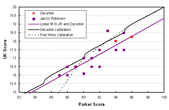
Comparison of UK scores vs. American (Parker) scores for white Côte d’Or Burgundy 2012. The black lines show how Decanter and Fine Wine (solid and dotted lines) make the correspondence between their 20 point scales and the 100 point scale.
Immediately you can see that there is a much better correlation here between the UK scores and Parker. Perhaps because there is less emphasis on power and fruit and oak in white wine evaluation, the tasters are in better agreement. The standard deviation from the straight (purple) line is about half a point, so that gives us an idea of the uncertainty in scoring under the best of circumstances – that ½ on the 20 point scale turns into about 2 on the 100 point scale (math nerds can derive that correspondence from the slope of the line).
It is also interesting to look at the Decanter and Fine Wine published translations of a 20 point scale into a 100 point scale. They are in agreement for high scores but Fine Wine plunges much lower below 90 as they force their equivalence to be 0/20 for a 50/100 score (which is the minimum possible on the Parker scale). What can also be seen is that the Decanter 100 point equivalents are lower than Parker. A good example is the highest score at 96, which is conveniently on the line (it is that average line that is the real source of the comparison). That wine gets 96 from Parker, and 18.25 on the 20 point scale. But if you look at the solid black calibration line, that 18.25 is considered to be equivalent to 94 on the Decanter scale. Another important example is that the 90 point threshold that so many people are fascinated by would be scored 16.7 on average by the UK crowd (purple line), which is equivalent to about 88.5. In other words, stop being fixated on absolute scores. Look at how your favourite critic rates wines on a relative scale and most of all, buy on description, not score.
Let me summarize the conclusions that I have drawn in this post:
- Comparisons of scores from different reviewers is chancy at best.
- Pick a critic whose tastes are close to your own.
- A wine with a very high score will usually turn out well, and conversely for a very low score, but in the middle ignore the scores and focus on the description. Note that “90” is in the middle, so it is not some magic number.
- There is at least a 0.5 point random variation on the 20 point scale and a 2 point variation on the 100 point scale; i.e. scores separated by that amount or less are not meaningfully different.
- This conclusion is a bit of a stretch from such a small sample, admittedly, but scores appear to be more reliable for whites and least reliable for New World reds.


